National urban percent hides primate cities
One megacity can skew a country's average — read city-level tables.
The species is stacking into cities — megacity corridors, informal settlements and new urban cultures.
Side-by-side cultures and maps — never race ranks.
Read the map layers
Last reviewed Sources & creditsMedia creditsMethodology
Five research punchlines — scan before you dive.
Urbanization is a reference layer for the Peoples atlas: patterns you can check, not a podium for continents.
Each layer explains what the measure is, where it misleads, and how it connects to culture pages without racial ranking.
Demography and linguistics change; treat figures as era-bound.
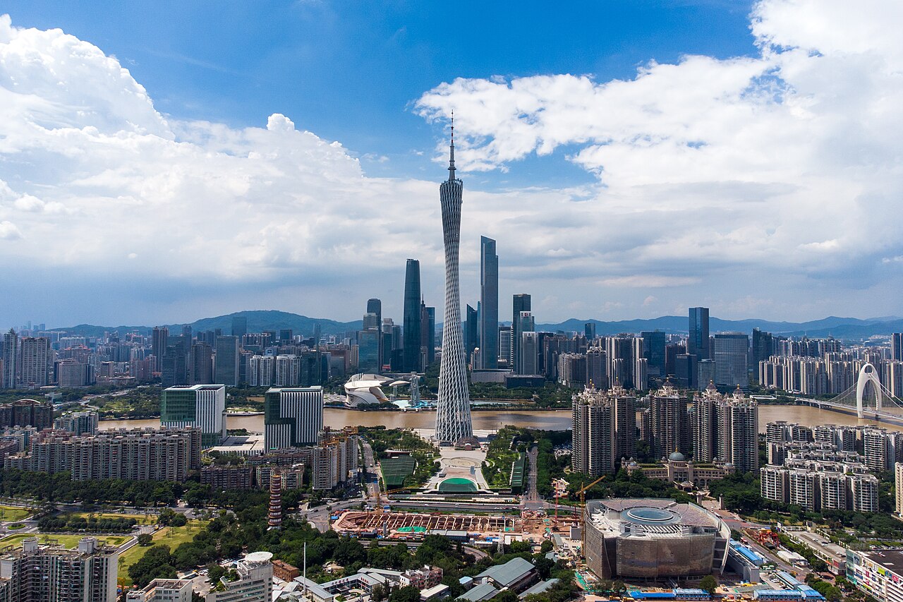
What Urbanization measures and why it matters.
This layer exists to answer “where?” and “how connected?” without sliding into “who is better?”
Read it beside culture pages: tongues, cities and migrations are how peoples actually meet.
Thick labor markets, universities and specialized medicine pull youth.
Self-built neighborhoods house huge shares of urban growth.
Festival calendars and languages densify and hybridize downtown.
Coastal megacities face compounding heat and flood risk.
Urban skill and “civilization” talk often smuggled racial hierarchies; density is economics.
Signals a careful reader looks for — and the traps that turn maps into myths.
One megacity can skew a country's average — read city-level tables.
Slum/informal polygons need explicit layers or maps lie by omission.
Datafication can surveil — culture layers include resistance and right to the city.
Ranking rural as backward repeats civilizational slurs — migration is multidirectional.
Scholarly themes rewritten for curious readers — not paywalled jargon, and never a race ranking.
The share of people in cities rose unevenly; definitions of “urban” differ by country.
Takeaway Compare definitions before charts.
Slum/informal settlement research stresses ingenuity and governance failure together.
Takeaway Informality is infrastructure too.
Cities run hotter; inequality maps onto shade and AC access.
Takeaway Heat is stratified.
Lefebvre-inspired work asks who gets to shape urban culture.
Takeaway Streets have politics.
Sensor urbanism can become surveillance; culture layers include resistance.
Takeaway Datafication isn’t neutral.
Books, reviews and museum trails — starting points, not a syllabus.
Critical urban geography — informality is infrastructure too.
Shade and AC access stratify cities — heat maps need class layers.
Interactive density and transit displays — dots beat flat colors.
St Louis high-rise failure — who gets to shape urban culture.
Definitions of "urban" differ by country — compare before charts.
No. Atlas pages refuse superior/inferior framing.
When masters revise; UN and linguistic datasets move — check dates in prose.
Yes, with attribution to Tool-Lifes and underlying public datasets named in text.
Reusable licences and stable Wikipedia titles feed our media pipeline.
No. They show languages, density, migration or methods — never race league tables.
Cultural pages note conflict when relevant; atlas layers prefer demographic basins over propaganda maps.
The metric is not; using it to rank human worth is.
Pair this page with Race is not biology in the diversity pillar.