Choropleths hide city dots
Country colors erase Lagos, Dhaka and São Paulo density — zoom to urban layers.
Where people actually live — density corridors, youth bulges and aging societies — as demography, not destiny rankings.
Side-by-side cultures and maps — never race ranks.
Read the map layers
Last reviewed Sources & creditsMedia creditsMethodology
Five research punchlines — scan before you dive.
World population is a reference layer for the Peoples atlas: patterns you can check, not a podium for continents.
Each layer explains what the measure is, where it misleads, and how it connects to culture pages without racial ranking.
Demography and linguistics change; treat figures as era-bound.
What World population measures and why it matters.
This layer exists to answer “where?” and “how connected?” without sliding into “who is better?”
Read it beside culture pages: tongues, cities and migrations are how peoples actually meet.
River valleys, coasts and volcanic soils still hold outsized shares of humanity.
Median ages differ sharply; that shapes schools, armies and pensions.
Cities grow from villages and from other countries simultaneously.
Falling child mortality preceded falling fertility almost everywhere.
Older race ecology myths about who “belongs” where fail basic demography.
Signals a careful reader looks for — and the traps that turn maps into myths.
Country colors erase Lagos, Dhaka and São Paulo density — zoom to urban layers.
Age structure predicts schools, pensions and labor — one number misleads.
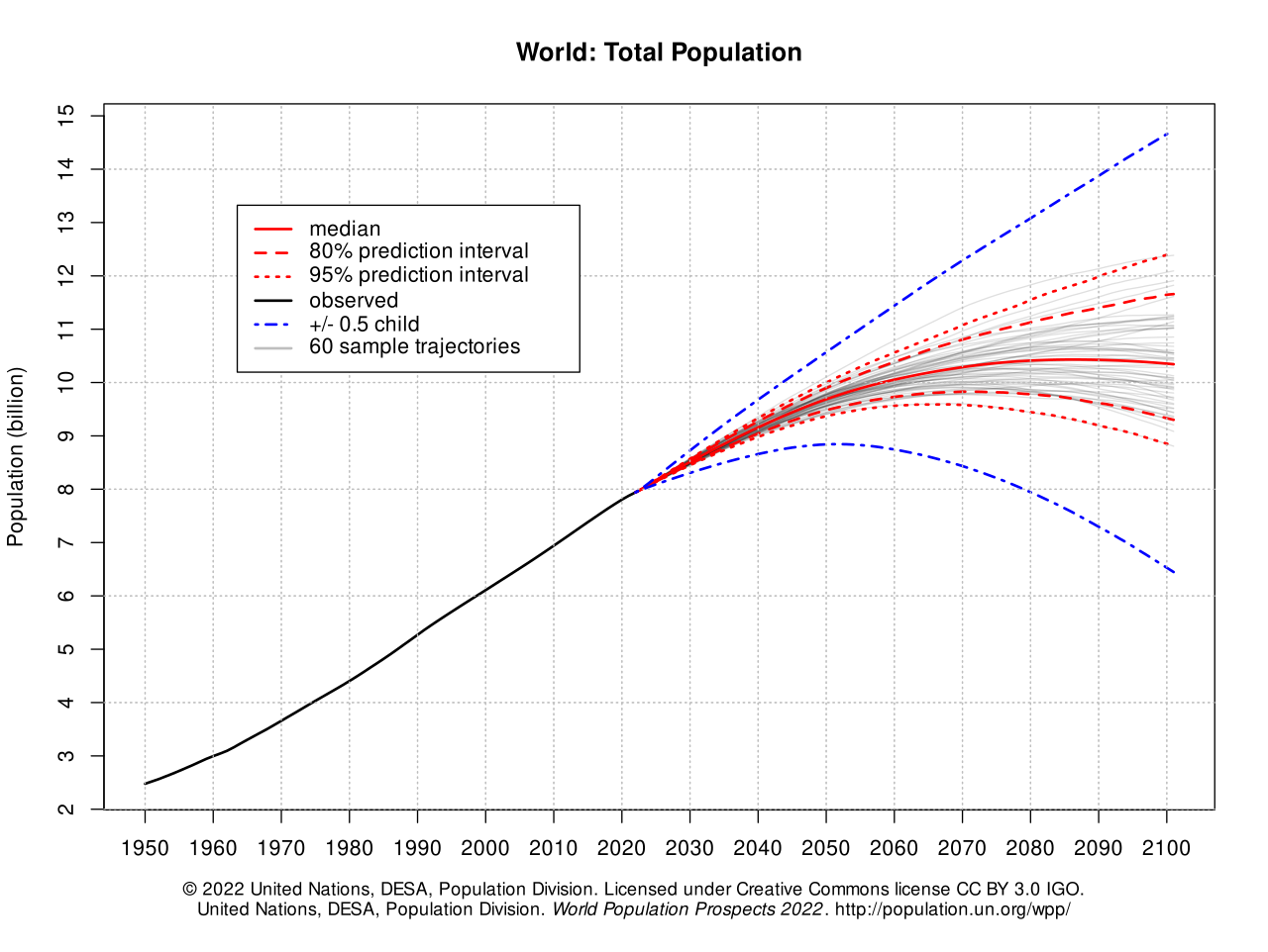
UN high/low variants diverge — treat 2100 headlines as scenarios, not fate.
Older race ecology myths about who "belongs" where fail basic demography — reject them.
Scholarly themes rewritten for curious readers — not paywalled jargon, and never a race ranking.
Classical transition theory links mortality/fertility declines to development — with regional twists and policy shocks.
Takeaway Population change is social.
World Population Prospects revisions teach that counts are models with uncertainty cones.
Takeaway Treat headlines as provisional.
More humans live in cities; atlas layers must show density, not just country choropleths.
Takeaway Dots beat flat colors.
Age structure shapes labor, care and politics differently across regions.
Takeaway Pyramids predict pressure.
Malthusian panic has racist and classist afterlives; modern demography is more empirical and humble.
Takeaway Fear narratives need audit.
Books, reviews and museum trails — starting points, not a syllabus.
Demography instincts with humility about forecasts — antidote to Malthus panic.
How variant projections work — provisional, not prophecy.
Interactive charts with citations — classroom-ready.
Fertility, women's education and policy — population change is social.
Quick country snapshots — check dates, not destiny rankings.
No. Atlas pages refuse superior/inferior framing.
When masters revise; UN and linguistic datasets move — check dates in prose.
Yes, with attribution to Tool-Lifes and underlying public datasets named in text.
Reusable licences and stable Wikipedia titles feed our media pipeline.
No. They show languages, density, migration or methods — never race league tables.
Cultural pages note conflict when relevant; atlas layers prefer demographic basins over propaganda maps.
The metric is not; using it to rank human worth is.
Pair this page with Race is not biology in the diversity pillar.